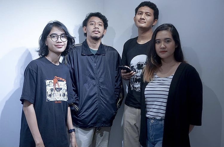
Studio 4oo2 is a team of four students from the University Universitas Negeri Jakarta, majoring in visual art education, who came together to design a visual identity for documenta fifteen.
The name “4oo2” derives from the amount spent on parking tickets (4,000 rupiahs for two motorcycles) at the only available twenty-four hours space, a fast-food restaurant the team used as their working space to develop the proposal. Studio 4oo2’s winning concept is based on the central image of hands. This core element of the visual identity for documenta fifteen expresses the attitude and gesture of lumbung, which can be summarized as a platform for sharing, solidarity, and friendship. The design’s color palette is inspired by natural fabric dyes from the eastern part of Indonesia.
4oo2 will develop and apply the main visual identity for documenta fifteen together with professional partners. The team consists of Angga Reksha Ramadhan, Larasati Fildzah Kinanti, Louisiana Wattimena, and Rosyid Mahfuzh.

Studio 4oo2, Group picture, 2020, Photo: Studio 4oo2 / Elrisyad
Studio 4oo2 on their approach:
“The concept of lumbung is visualized in our design through the form of the hand, a sensing part of the body that has the ability to support human activities such as holding, giving, or embracing. The hand has a very crucial role in any interactive process between humans, either directly or indirectly. As a symbol it is directly connected to the concept of lumbung, a collective storage for crops communally grown. These activities—harvesting, holding, sustaining—all involve the hand, just as lumbung’s purpose is linked to the hand as a way of connecting people. In our design, cords of rope form the shape of hands, symbolizing the strong bond between individuals and things. Knots allow rope to function as a connector to create far-reaching ties, sustained without limit. The hands depicted in rope describe a communal society that has no limits and offers a sustainable process for the future. The design’s color palette was adapted from natural fabric dyes used for generations in Indonesia to manufacture traditional textile products. These colors were taken mostly from eastern Indonesia, where lumbung is still active.”