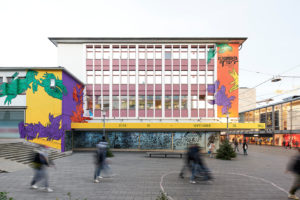
On December 15, 2020, documenta fifteen (June 18 to September 25, 2022) will present its visual identity to the public. The graphic design, developed in collaboration with students, is inspired by documenta’s lumbung concept.
With the symbol of the hands, documenta fifteen’s appearance, which was developed out of the design concept of the Jakarta student collective Studio 4oo2, refers to the lumbung principle on which ruangrupa based its documenta, which is all about collective practices of sharing, solidarity and friendship.
lumbung is the Indonesian village practice where farmers store the surplus of their harvest in a rice barn for the future well being of the community, and distribute it according to collectively determined mechanisms. By taking lumbung not only as a theme, but as a practice, documenta fifteen aims to rethink ways of building sustainability of artistic practices around the world through sharing resources not just economically, but also in terms of ideas, knowledge, programs, and innovations. Principles such as collectivity and collaboration, resource development and fair distribution are at the forefront here.
The hands depicted in rope describe a communal society that has no limits and offers a sustainable process for the future. This core element of the visual identity for documenta fifteen expresses the attitude and gesture of lumbung. The design’s color palette was adapted from natural fabric dyes used for generations in Indonesia to manufacture traditional textile products. These colors were taken mostly from eastern Indonesia, where lumbung is still active.
Collective Development with Students
ruangrupa itself emerged in the mid-1990s from student networks at the art academies in Jakarta and Yogyakarta. For the artists’ collective, polyphony and the integration of the perspectives of the younger generation is key. Learning from this experience and background, in the end of 2019 ruangrupa invited students from Kassel and Jakarta to take part in developing documenta fifteen’s visual identity, instead of relying solely on established design agencies. From more than twenty submissions by individuals and groups, two design proposals were selected: Studio 4oo2 from Jakarta and kmmn_practice from Kassel.
The teams submitted two very different concepts and each has been given the opportunity to pursue their own approach. In the process, Studio 4oo2 was tasked with developing documenta fifteen’s overall design identity, while kmmn_practice was given the chance to implement their participatory approach for the visual appearance of the ruruHaus. In the early summer of 2020, the Studio 4oo2 students began their collaborative work with Berlin brand agency Stan Hema and documenta’s in-house designer Leon Schniewind.
Presentation in Film Clips and within the Public Space
documenta fifteen will be presenting its visual appearance by means of a film clip and features within Kassel’s public space. Among other places, it will be visible at the ruruHaus, the first venue of documenta fifteen: there it has been applied to the façade in the form of a large mural by Kassel graffiti and street art project KolorCubes. Further presences on large surfaces or advertising columns can be found in the urban space. The visual appearance and its development is presented in detail in this video.
Today, Tuesday, December 15, 2020, at 3 pm, a photo session with representatives from ruangrupa, Lord Mayor Christian Geselle, General Director of documenta und Museum Fridericianum gGmbH Dr. Sabine Schormann, and the documenta fifteen communications team will be held in front of the documenta Halle. This will purely be a photo opportunity, taking into account the hygiene and distancing regulations. We kindly ask you to register in advance at presse@documenta.de.
The Chairman of the Supervisory Board of documenta und Museum Fridericianum gGmbH, Lord Mayor Christian Geselle, is delighted with the new visual identity: “documenta fifteen is now taking shape. Many interlocking hands stand for cohesion and a new togetherness. The magnificent transformation of the design into a mural on the ruruHaus sends out a clear salutation to the city from the ruangrupa curatorial team. It is a colorful and, above all, optimistic message pointing to the future at the end of a year that has been exhausting for everyone. And anticipation for the next, eagerly awaited documenta is growing.”
Studio 4oo2 on the Visual Design
“The lumbung concept is visualized in our design by the shape of the hand, a feeling part of our bodies, which is used in human activities such as holding, giving or hugging. The hand, directly or indirectly, plays an essential role in interactive processes between people. As a symbol it is directly linked to the concept of lumbung, a collective repository for the harvest produced by a community. These activities – harvesting, togetherness, sustainable support – all require the involvement of hands, just as the purpose of lumbung refers to the hand that connects people,” say Studio 4oo2.
Studio 4oo2 is a team of four students from Universitas Negeri Jakarta. The name “Studio 4oo2” (pronounced: “four-oh-oh-two”) is derived from the amount of money the students had to pay out in parking tickets (4,000 Rupiahs for two motorcycles) at the fast-food restaurant the team used as a workplace when developing their application, as this restaurant was the only place they could access 24 hours a day. The team consists of Angga Reksha Ramadhan, Larasati Fildzah Kinanti, Louisiana Wattimena and Rosyid Mahfuzh.